Do you know how effective your last promotional banner was? Are your brochures or flyers generating talk and translating to sales? Perhaps it is time you review your marketing materials, but before you start reaching for your sketch pad, it is important for you to understand the different elements of design and how they influence the buying behaviour of customers. You have to study which graphics will best represent your brand and what text and call to actions have the best chance at conversion.
Key to that is understanding how colours attract people into remembering brand identities and engaging with your products and services. We have put together a short psychological interpretation of colour to help you better understand the role it plays in changing a customer's feelings and attitudes to your brand.

- Blue is a shade that translates to trust, integrity, honesty, intelligence, confidence, and expertise. If you are projecting a serious, corporate mood for your product, use the darker tone of this colour. If you are going for a calming effect on your consumers, it is best to use light blue for your promotional materials.
- Red, an emotionally intense colour, is connected with energy, strength, power, passion, desire, love, and even danger and war. It is a colour that suggests immediate decisions so it is ideal for call to actions (what we call “BUY NOW” banners). With its high visibility and the ability to lift your graphics and text to the foreground, red is perfect in attracting a target audience right away.
- Yellow is a warm colour that is associated with happiness, joy, energy, warmth, and playfulness. If you want to evoke cheerfulness and pleasant feelings from your audience, then this colour is perfect to use. Be careful not to overuse this shade though as it can create a disturbing effect on the viewers. Never use dull yellow for it is associated with sickness, jealousy, decay, and caution.
- Green, being the most relaxing colour for the human eye, represents freshness, growth, health, fertility, and peace. It is ideal for advertising environmentally friendly products, drugs and medical items, and the like. Dark green can be used to promote services related to finance, banking, and money-for this colour symbolises ambition and protection.
- White, the purest of all colours, symbolises safety, cleanliness, faith, and coolness. It is ideal for products that suggest simplicity (like high-tech goods) and perfection. Since white also represents safety and sterility, it is perfect in promoting low-fat food, medical products or hospitals.
- Black, despite being considered mysterious and negative, is a colour that represents authority, elegance, prestige, and strength. So if you are promoting high-end products, black is perfect for you. Black can also help text and images stand out so it is the ideal background to any banner. It is also important to remember that black is also the colour of death and grief so be extra careful when designing your banner messaging.
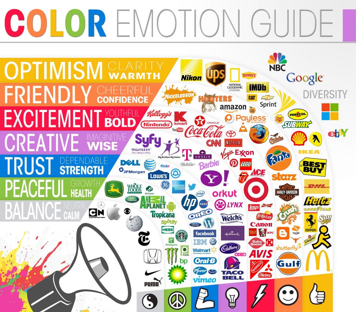
Have a look at what notable brands utilise color in their logos and overall approach to marketing.

Remember that in advertising and branding you do not just choose a certain colour because you prefer it. You have to consider the target market of your product or service. If you are selling perfumes for men, then by all means do not use pink in your packaging. Aside from that you should remember that the mood and image your product evokes can highly influence your market into purchasing your products or services. That is why it is vital you understand which colours and combinations match your company's marketing objective.


