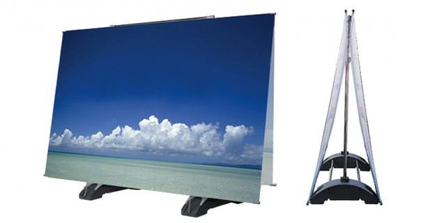
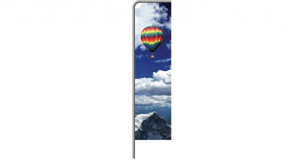
Outdoor Flags & Banners
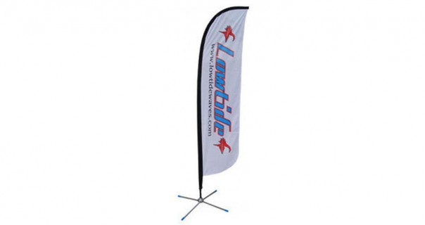
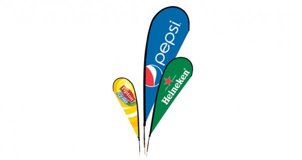
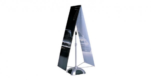
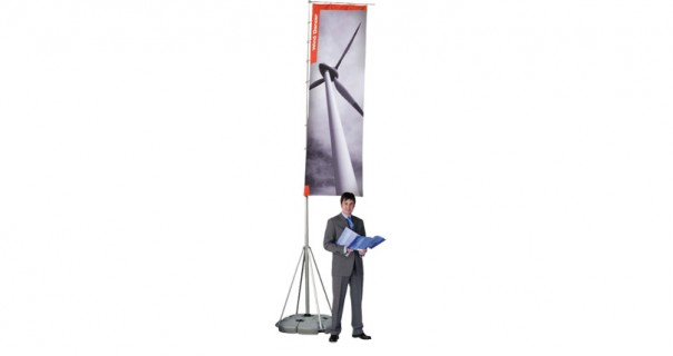
Grab attention, indoors and out, with a flying banner or flag Read more
Why Outdoor Flags & Banners?
 Hardwearing
These advertising banners have been specifically designed for outdoor use, so you can rest assured that they will withstand the elements with ease.
 Maximum Exposure
The outdoor display banners offered by Displays Direct will offer your brand maximum exposure.
 High Resolution Graphics
Displays Direct only uses “A-grade” graphics in the manufacture of outdoor banners and promotional flags. They are digitally printed at high resolution. Our graphics are also scuff and tear resistant, which is handy when used outdoors, and wipe down easily.
 Suit Many Locations
Our stand up banners can be effectively used in any location, from a car dealership’s forecourt and on a golf course through to exhibition display stands and in front of stores. As these advertising flags can also be used indoors, their use doesn’t end when the event is over.
 Attention Grabbing
We have found that outdoor advertising banners in Sydney are highly effective at grabbing the attention of passing traffic and pedestrians. In fact, moving or rotating flying banners are three times more effective at drawing attention than static ones. This makes them quite a powerful medium, particularly when advertising on busy streets and walkways.
 Improved Experience
The use of wire brochure holders and zig zag brochure stands actually enhances the experience of potential customers who visit your booth. This is because it provides them with takeaway information, which they can then use to get in touch with you at a later date. Some of our A4 brochure stands upwards also feature covers to protect promotional material from inclement weather.
 Design Tips
The effectiveness of having a clear message on your promotional banners should never be underestimated. Trying to be too many things to too many people or trying to convey too many messages can actually be fatal to the design.
- Remember that certain colours and fonts are easier to read than others, and that they might carry certain weight in the minds of your audience. Script or Serif fonts, for example, can sometimes be hard too read when passing by advertising flags in Sydney at speed.
- Whilst colour can certainly evoke different responses, keep in mind that too much colour can be bad at times. The strategic use of “dead space” (or blank areas) can be very powerful. A minimalist promotional banner design can be very effective in getting your message across.

Here you will find all of our artwork specifications to ensure the perfect display first time, every time.

We work with customers in all states. We will provide you with a quote for delivery upon enquiry.

See what's making news in exhibiting along with helpful tips to make your business look great.
